In this thought-provoking article, Dan Coman argues that contemporary art offers an unexpected lens for rethinking environmental graphic design (EGD), challenging designers and asset owners to consider not just how people navigate retail environments, but also how they build trust in the spaces around them. Every shopping centre is designed to communicate. From the moment customers enter a car park to the time they find a retailer, navigate a precinct or locate amenities, subtle visual cues shap
e their journey – often without them even noticing. For environmental graphic designers (EGD), the challenge is to create systems that feel intuitive, building confidence and trust through clear, almost invisible communication.
That idea was unexpectedly challenged during a recent visit to Sydney’s Piermarq gallery.*
On a rainy Saturday afternoon, I wandered in looking for an artistic distraction and instead found an unexpected lesson in EGD.
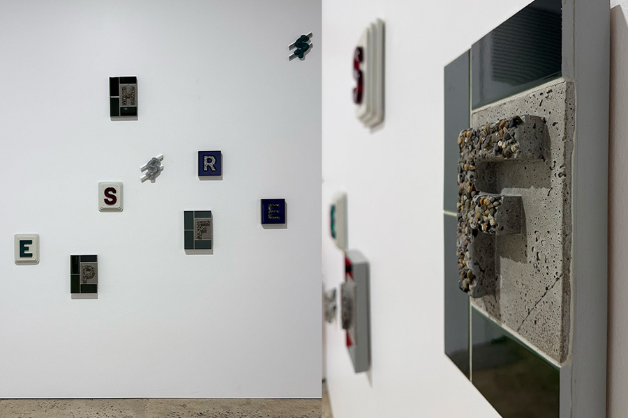
The exhibition, Faulty Cognitions, blurred the boundaries between art, signage, architecture and spatial communication, prompting me to think differently about the visual cues we rely on every day and the assumptions they ask us to make.
I went because a colleague mentioned the show, because it was a wet Saturday afternoon, and because Faulty Cognitions is exactly the kind of title that makes you want to know what’s behind the door. What I found was a brilliant blurring of art, signage, architecture and design thinking.
Walking into Piermarq* is much like entering many traditional galleries, white walls, printed price catalogues, spacious warehouse vibes and classic overhead lighting. As you are greeted by the lovely gallery assistant, it feels familiar, with the great benefit of being split over two levels, giving you a unique ‘eye to art’ level for the works mounted up high, showcasing Tom Ferson’s work and an overview of the wider space.
Ferson’s practice appears to sit at an intersection that doesn’t have a clear name. It draws on the visual language of signage, the spatial logic and materiality of architecture, and the emotional register of fine art and sculpture, without neatly fitting into any one of them. Faulty Cognitions is, at its core, a body of work about reading meaning into what surrounds us in the built form. How we trust the visual cues in our environment, and how reliably or unreliably that trust is misplaced, with the unseen being generated through faulty cognition.
The thing EGD and art share, and where they diverge
EDG and fine art have more in common than either discipline typically acknowledges.
Both are working with the same raw materials: subject, colour, form, space and the moving human body navigating all of it. Both are asking how visual information lands and whether it directs, reassures, disorients, or means something. Both are acutely aware that the context in which something is placed is inseparable from the message it carries – curation can create, dispel or manipulate interpretation.
Where they diverge is in intent and in what they’re permitted to do with ambiguity and interpretation.
EGD at its best is an attempt to remove cognitive friction. A well-designed wayfinding system should feel effortless, should give people exactly the information they need, at exactly the moment they need it without demanding that they think about it. The goal is clarity. The sign should disappear into the background of experience, noticed only when it fails.
Art, at least art like Ferson’s, is doing the opposite. It is deliberately introducing perceptive friction. It wants you to pause at the sign, to question what it’s telling you, to notice the gap between the message and the meaning – what’s seen and unseen. Faulty Cognitions as a title is not incidental, it is the proposition. Our cognition is faulty. The systems we trust to organise our experience are unreliable. What happens when you become aware of that?
I think this is demonstrated through Tom’s artwork titled “Stay” – objectively a large-format text piece, with depth and presence in the gallery space. At first glance, the typography tells a story, with the colour, form and materiality pulling you in, offering vibes of ‘retro hotel’ comfort. The pebblecrete creates a foundation, celebrating an era of architecture synonymous with the hardscape, poolside boom of the ’70s and ’80s – the great Aussie backyard dream – while the message within the bold type creates both tension and relief.
To “Stay” implies an acceptance, perhaps an acceptance of a time that challenges the disruption and ongoing unknown within the current global climate. Or, maybe it’s just art.
What I kept thinking about
I keep returning to the question of intention.
Signage carries authority by convention. We’ve been trained since childhood to trust it, to follow the signs, to see the symbols, to believe that the word on the wall reflects something true about the space it inhabits. That training is so deep that most of us don’t examine it. We just comply.
Ferson’s work makes that compliance visible. It holds up the conventions of environmental communication and asks what happens when you look at them not as instructions but as artefacts. As things made by someone, with choices embedded in them, carrying assumptions about who is being addressed and what they are expected to do.
That is a question EGD practitioners should be asking constantly. Who made this decision? Who does this system serve? Whose experience of this environment has been designed and whose has been overlooked?
Why this matters for the retail environment
The best EGD work has always understood that spatial communication is never neutral. It’s intentional and purposeful. When signage becomes overcomplicated by design, it loses the very thing it was made for and strays into a place that almost becomes performative. This doesn’t mean the design needs to be uninspired, but it does need to meet the baseline criteria of clear communication – it should balance beauty and logic.
A wayfinding system that works efficiently for a native English speaker but fails a person with limited English literacy is not a neutral design, it is a design that has made a choice, whether consciously or not. A retail environment that reflects one version of a community’s culture is not an objective statement, it is a communication with a point of view baked in.
Art like Ferson’s is a useful mirror for that reality. It shows us what spatial communication looks like when its conventions are made strange, when the authority is questioned rather than accepted, when the gap between sign and meaning is held open rather than closed.
While I believe EGD should be designed to reflect the world it lives in, I don’t think EGD should aspire to be art.
The disciplines are doing different work for different reasons. But I do think EGD practitioners should spend time with work like this to train themselves to see their own discipline from the outside, to notice assumptions embedded in the systems they design and to ask whether those assumptions are serving the people who move through the spaces they create.
EGD practitioners in the art world offer us alternative ways to understand communication through creativity. While this article has focused on signage and wayfinding due to the nature of Tom’s latest exhibition, the art world has the power to teach and inform our work. The intention is the key here, and understanding your audience. Who are you speaking to and why?
This article is featured in SCN magazine.






Add comment